1.1. Creating plublication-quality figures
Matplotlib is a decent Python library
for creating publication-quality plots which offers a multitude of
different plot types. However, one limitation of matplotlib is that
creating complex layouts can be at times complicated. Therefore,
post-processing of plots is usually done in some other vector graphics
editor such as inkscape or Adobe
Illustrator. The typical workflow is as following:
- Import and analyse data in Python
- Create figures in
matplotlib - Export figures to PDF/SVG
- Import figures to vector-graphics editor
- Arrange and edit figures manually
- Export the figure to PDF
As you probably see, the typical workflow is quite complicated. To make things worse you may need to repeat the process several times, when, for example, you want to include more data into the analysis. This includes manual editing and arranging the figure, which is obviously time consuming. Therefore it makes sense to try and automate the process. Here, I will describe an automatic workflow which completely resides on Python tools.
Create plots
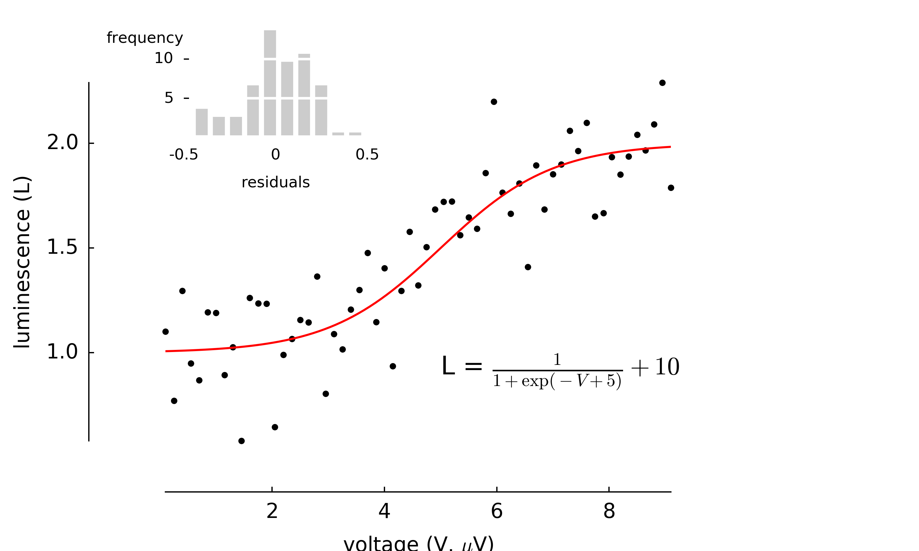
First you need to create nice matplotlib-based plots you would like to compose your figure from. You may download the scripts I will use in the example from github repository: anscombe.py and sigmoid_fit.py.
sigmoid_fit.py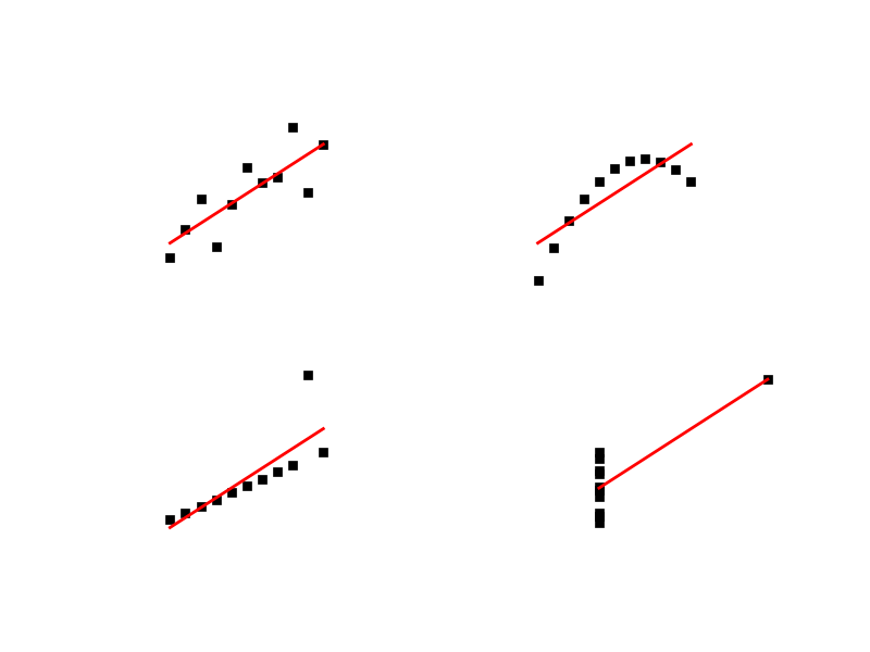
anscombe.pyExport to SVG
A nice feature of matplotlib is that it allows to export figure to Scalable Vector Graphics (SVG) which is an open vector format [1] understood by many applications (such as Inkscape, Adobe Illustrator or even web browsers). Not going too much into details, I will only say that SVG files are text files with special predefined tags (much alike HTML tags). You may try to open one of them in a text editor to find out what I mean.
Arrange plots into composite figures
Now, we would like to combine both plots into one figure and add some annotations (such as one-letter labels: A,B, etc.). To this end, I will use a small Python package I wrote with this purpose
svgutils. It is written completely in Python and uses only standard libraries. You may download it from github.The basic operations are similar to what you would do in a vector graphics editor, but instead of using a mouse you will do some scripting (I am sure you love it as much as I do). It may take some more time at the beginning, but with the advantage that you will not have to repeat the process when, for some reason, you need to modify the plots you generated with matplotlib (to add more data or modify the parameters of your analysis, just to name a few reasons).
An example script is shown and explained below:
import svgutils.transform as sg
import sys

#create new SVG figure
fig = sg.SVGFigure("16cm", "6.5cm")

# load matpotlib-generated figures
fig1 = sg.fromfile('sigmoid_fit.svg')
fig2 = sg.fromfile('anscombe.svg')

# get the plot objects
plot1 = fig1.getroot()
plot2 = fig2.getroot()
plot2.moveto(280, 0, scale=0.5)

# add text labels
txt1 = sg.TextElement(25,20, "A", size=12, weight="bold")
txt2 = sg.TextElement(305,20, "B", size=12, weight="bold")

# append plots and labels to figure
fig.append([plot1, plot2])
fig.append([txt1, txt2])

# save generated SVG files
fig.save("fig_final.svg")
Convert to PDF/PNG
After running the script, you may convert the output file to a format of your choice. To this end, you can use
inkscapewhich can produce PNG and PDF files from SVG source. You can do that directly from command line without the need of opening the whole application:inkscape --export-pdf=fig_final.pdf fig_final.svg inkscape --export-png=fig_final.png fig_final.svg
And here is the final result:
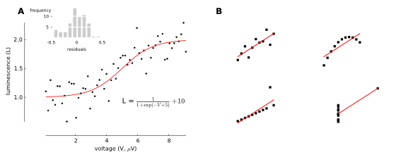
Final publication-ready figure.
Now, whenever you need to re-do the plots you can simply re-run the
above scripts. You can also automate the process by means of a build
system, such as GNU make or similar. This part will be covered in
some of the next tutorials from the series.
Good luck and happy plotting!
PS If you have a better/alternative method for creating your publication plots, I would be very interested in learning about it. Please comment or mail me!
| [1] | In case you do not know it, a vector format in contrast to other (raster) formats such as PNG, JPEG does not represent graphics as individual pixels, but rather as modifiable objects (lines, circles, points etc.). They usually offer better qualitiy for publication plots (PDF files are one of them) and are also editable. |